Smart ideas for interior colours, for each individual home space

Proposals for individual room walls, from living rooms to bedrooms to kitchen to the bathroom. Combinations and tricks to select optimal colours for indoor colours for your home.
Selection of colours for home interiors is a fun, creative as well as demanding process, since it encompasses your own personal style and mood, and also requires you to select handy, practical colours that match layout, furniture, decoration of the residence, as well as today’s trends.
Practicality and usability are primary indoor colour selection criteria. Also, the signature of each shade is important. Still, these are not the only criteria worth watching for. A house is a collection of walls and spaces.
Painting should be viewed as an integral process that will express the tenants’ style and character, at the same time meeting their own needs. Combining colours on individual walls, and the provision of a concept supporting each selection, are significant parameters of house painting.
A matter of asking why specific shades, instead of others, were used on certain walls. The following lines describe step by step (or, rather, room by room) a comprehensive proposal for house paint coating and interior design.
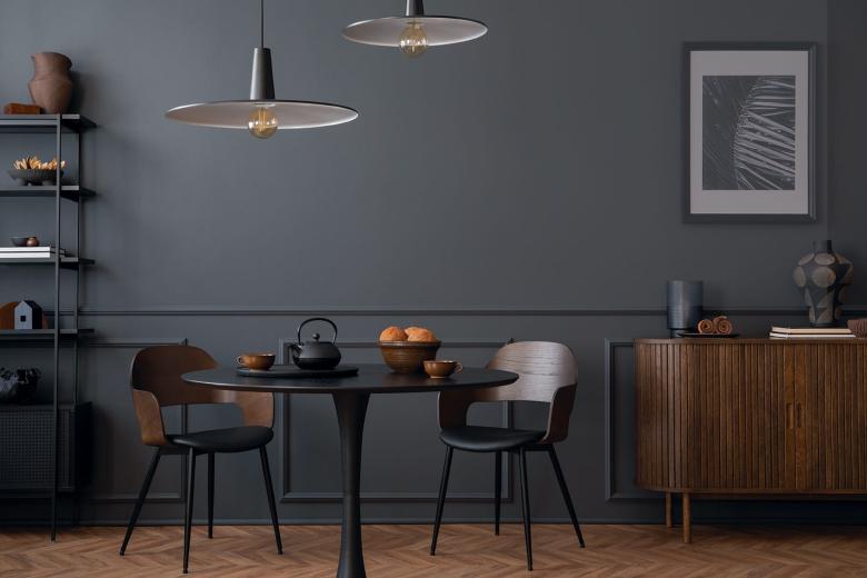
Coordinated colours for living rooms
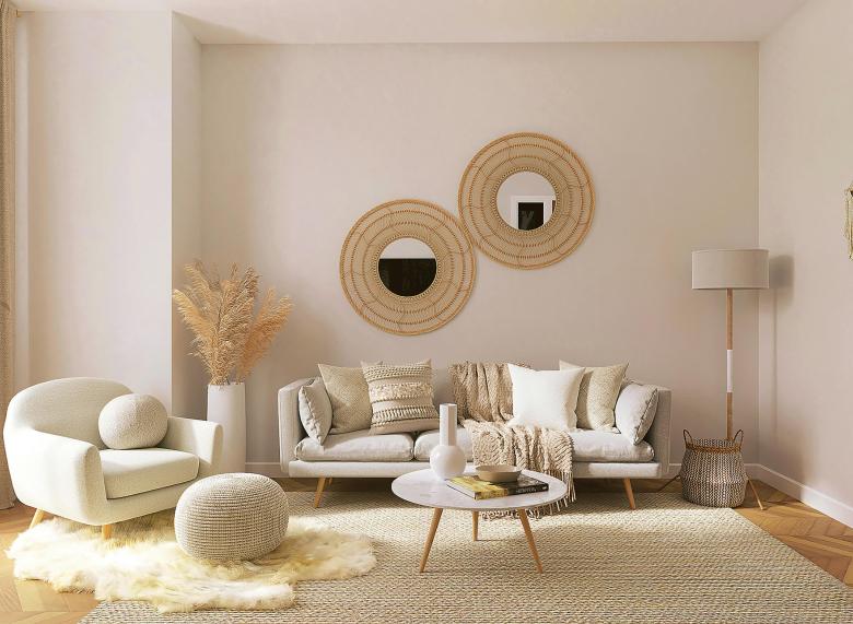
Experts know that neutral are colours being neither warm nor cool (such as white, grey, cream, coffee brown etc.). Hence they increase the chance of harmonious matching to interior decoration and furnishing. Such neutrality constitutes a safe approach for the living room, as it is not restrictive.
From our neutral colour family, we would propose light beige RC 126 Paxos Ore TSR% 59.1 from Reflective Collection. The specific shade generates a warm, welcoming indoor nude. It also blends perfectly with other - more pronounced - shades, creating a winning contrast, one that fits interior design - grade results.
Another fair option would be KR 2435 Tingle Green/F, a special pastel green shade with a vintage feel, one that also exudes classy, eclectic nuances. Being subtle yet elegant, it can be combined with various ornamental accessories, to boost or decompress the overall impression (blended with a flashier, baroque or other extravagant ornamental style).
Relaxing colours for bedrooms
Intense effects or highly saturated shades are discouraged in bedrooms, with the aim of mitigating turbulent feelings. Steadfastness is the key theme here, a prerequisite for physical and mental rest and relaxation.
So let’s start with a moderate deep blue able to generate and air of relaxation and spatial harmony. The KR 2180 Bermuda Shore/F shade radiates a tranquil deep calm sea and sky sentiment; it is ideal for decompressing any space, let alone bedrooms. It would be ideal even for child rooms, offering a perfect match to colourful furnishings, carpets and toys.
A dark grey would also represent a safe option, filling spaces with serenity; CG 753 Perissa Sand/F is such an earthly shade. It can be a backdrop to showcase drapes and beddings; these articles can be in intense shades for contrast, or in light neutral shades for a balanced effect.
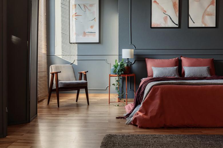
Further customization can be realized by applying textured finishes on certain wall surfaces (on two opposing vertical walls, for instance), nevertheless using minimal elements to avoid excessive results. In this case, the standard is to avoid excessive patterns or textures.
Modern combination for your kitchen
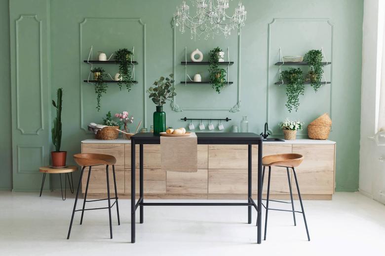
Kitchen is a space that would require renewal, renovation and recoating at times, as it often deteriorates from cooking and intense use. It would be advisable to use balanced wall colours with a touch of energy and joy, two elements necessary for the most congenial corner of the house.
In this context, CG 675 Almiriki/F green with a deeper, saturated tone, contributes the wealth of the Nature’s colours to interior spaces and offers a pinch of spiritedness. Furthermore, it exudes an air of serenity and firmness, hinting to sustainability and eco-friendliness.
In a more urban and state-of-the-art mood, the KR 2705 Silver Berch/F grey shade is a prefect fit to house settings that accommodate digitally-aware, technology-loving individuals. Such as shade poses an extra advantage: it is difficult to become stained. This will be surely appreciated.
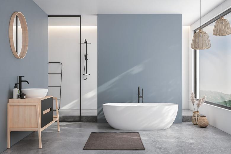
Modern shades for your bathroom
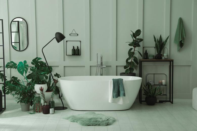
As a rule, bathrooms are viewed as functional spaces. The current trend is to have bathrooms promoting wellness, resembling minor spas where individuals nurture their bodies and decompress their spirit. There may be pleasant surprises hidden in paint coatings that exceed the grey and white staples.
Shades that mirror the colours of the Nature (shades of green, for instance), are capable of creating a sense of natural well-being. Such an example is the KR 2149 Camille/F shade, a moderate tonality green that evokes the freshness of a garden and performs ideally in light, window-fitted bathrooms.
A smooth navy blue, such as KR 2205 North Island/F shade, can be a quite interesting option. It offers a tone of royal elegance, at the same time providing spaces with depth and stance.
Let’s KRAFT! Find your ideal shade in Inspired Collection, Colors of Greece Collection & Reflective Collection and let the colours speak for your own sake!
Better still (and quicker, and with better focus) leverage the innovative tool Chat in Color that uses artificial intelligence as well as state-of-the-art algorithms, and find the shade you have in mind.

* All KRAFT Paints shades are found in the latest issue of Color Trends 2024 magazine, and you may review them here.
* Shades may slightly vary due to the colouring of photos, the display of your device or the nature of the surface to be coated.
