Small spaces can look bigger with color

One of the most frequent requests that architects and decorators hear from their clients is how to make a space bigger or at least give the illusion of seaming bigger. And one of the smartest and effective ways is paint!
Strategically placing colors that differ in tonality (light-dark) can really do wonders for ta space, depending on the needs of each room. So, for example, a small space looks bigger by applying light colors to all surfaces and using a darker color for the floor. In a long and narrow space, that we want to make it look wider, play with the contrast. Apply the darker color on the opposite small wall and paint the two large walls even darker and use a lighter shade on the opposite to lengthen the space. For a more successful result, it is safer to work with one color, as multiple colors tend to create visual boundaries.

Which color?
In addition to strategic placement, the selection of the appropriate shade is equally important to visually enlarge a space. Three general color directions are recommended to help trick the eye and enlarge a space:
Neutrals / Off-whites
A clean white may come to mind, but in the world of decorative colors, white is far from simply white. This color family is extremely versatile and the details in the shade can make all the difference. If you prefer neutral colors pick an off-white with yellow or red underlying tones for a warmer and more welcoming feeling in the space and of course do not forget to paint the ceiling. We recommend KR1017/F Rose Sand and KR1028/F Kiveli from the KRAFT Paints Inspired Collection. These shades are also great for updating your kitchen cabinets and making them look elegant and spacious!
Brights
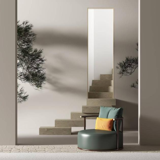
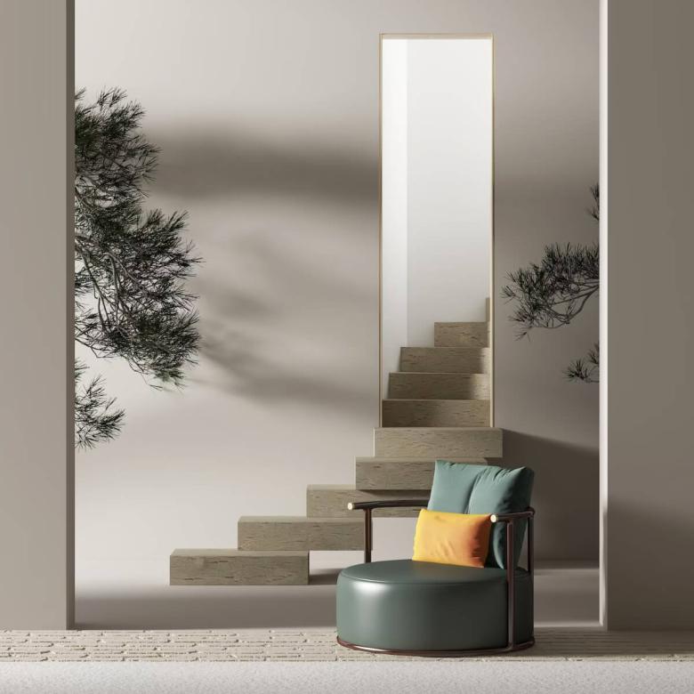
If you love color and can't live without it, there is a solution that will highlight your mood and work well even in a small space. All you need is to carefully choose the shade so that it absorbs natural shadows as much as possible and exudes freshness. Two great choices are teal KR1584 Ocean Jewel and bright yellow KR1156/F Dancing Queen, from the KRAFT Inspired Collection

Darks
The correct choice of dark shades can create the feeling of a larger space. This might sound contradicting, but it is because dark colors tend to show the boundaries and edges more indistinctly. A trend this year is clay red-browns like CG655 Pilos and deep greens like CG676/F Kiparissi, shades from the Colors of Greece Collection.
Master in every color
Master™ is designed to ensure the ideal result with the KRAFT Paints shades you choose.
KRAFT Paints' Master™ is a high-quality emulsion paint, certified by Eurofins with the finest European voluntary program Indoor Air Comfort™ organization with extremely low VOCs emissions contributing to a healthier indoor air. It contains fungicidal additives that protect its dry film against mold, and it is suitable for humid environments.