These are ultra -modern colors and the optimal combinations for your living room

Tips, tricks, trends and suggestions on the colours to be applied on the walls of the most welcoming place of your home. They are guaranteed to set your living room at the focal point of your home environment.
Your living room is the place for relaxing, watching your favourite show, reading or communicating with your loved ones, briefly stopping or even taking a nap. Contrary to the past when the living room was only reserved for guests, modern urban living rooms are open at all times. Wall shades are just as important as decoration itself, to produce a cozy, feel-good and enjoyable home atmosphere. The shades you choose, should result in a background matching the furniture and other decorative elements, however they should also reflect the tenants’ individual taste. Also, they should subtly reside in the background without attempting a bright or radiant presence. With a few exceptions, neutrality, minimalism and subtlety are preferable to showiness and flash. Let’s explore this approach through several colour scheme options.
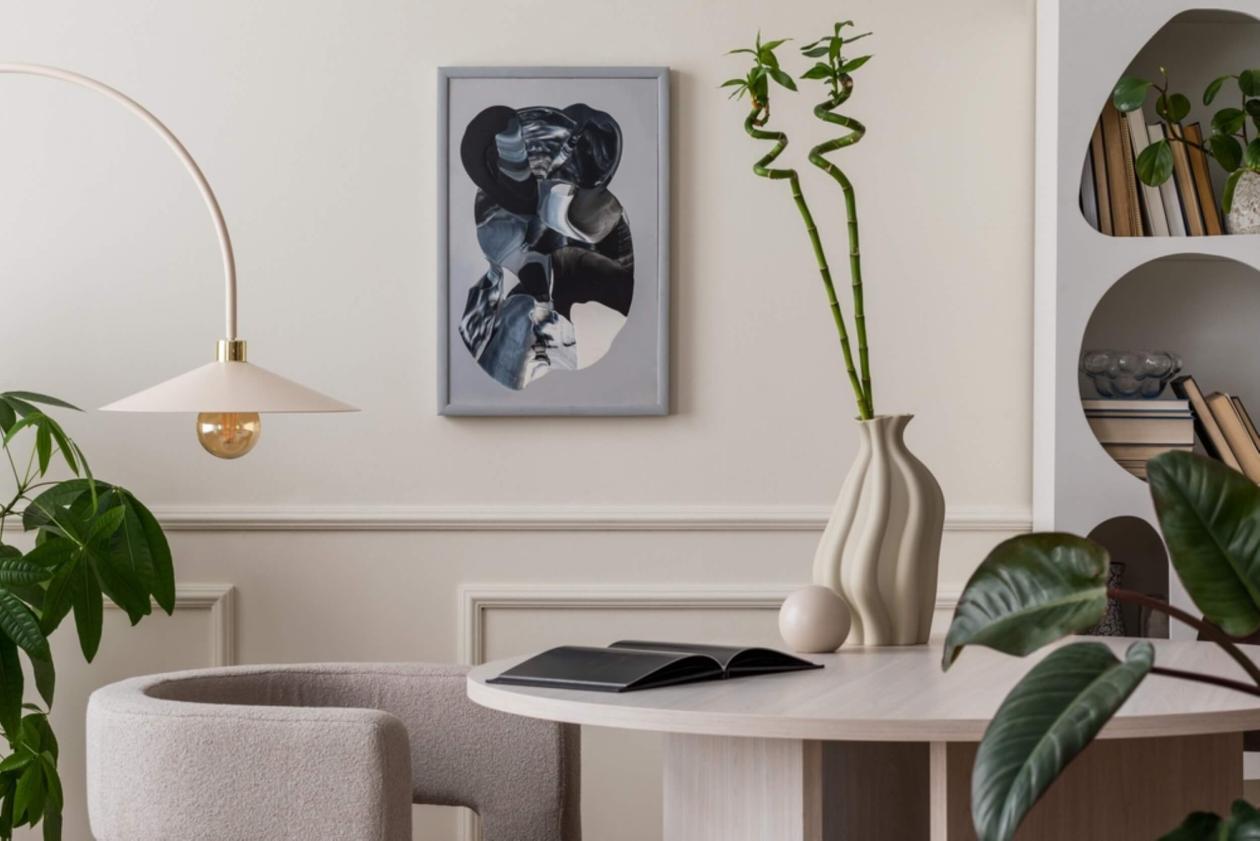
Congenial white shades for the living room
White shades brighten spaces, making them look larger. Another advantage is that they can blend with the vast majority of interior design styles. From conventional urban styles with industrial design highlights and arrays of home entertainment appliances, to boho style furniture, where white is the ideal foundation to build a spirited, colourful result. Such timeless and safe shades are KR1103 Absolutely White / F and KR1108 Μystic White by KRAFT Paints from the Inspired Collection fandeck. Among others, these add a spontaneous luxury feel.
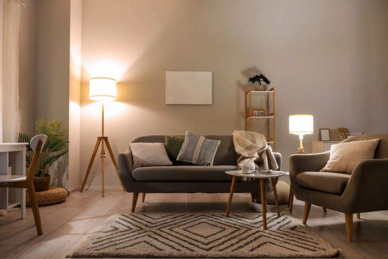
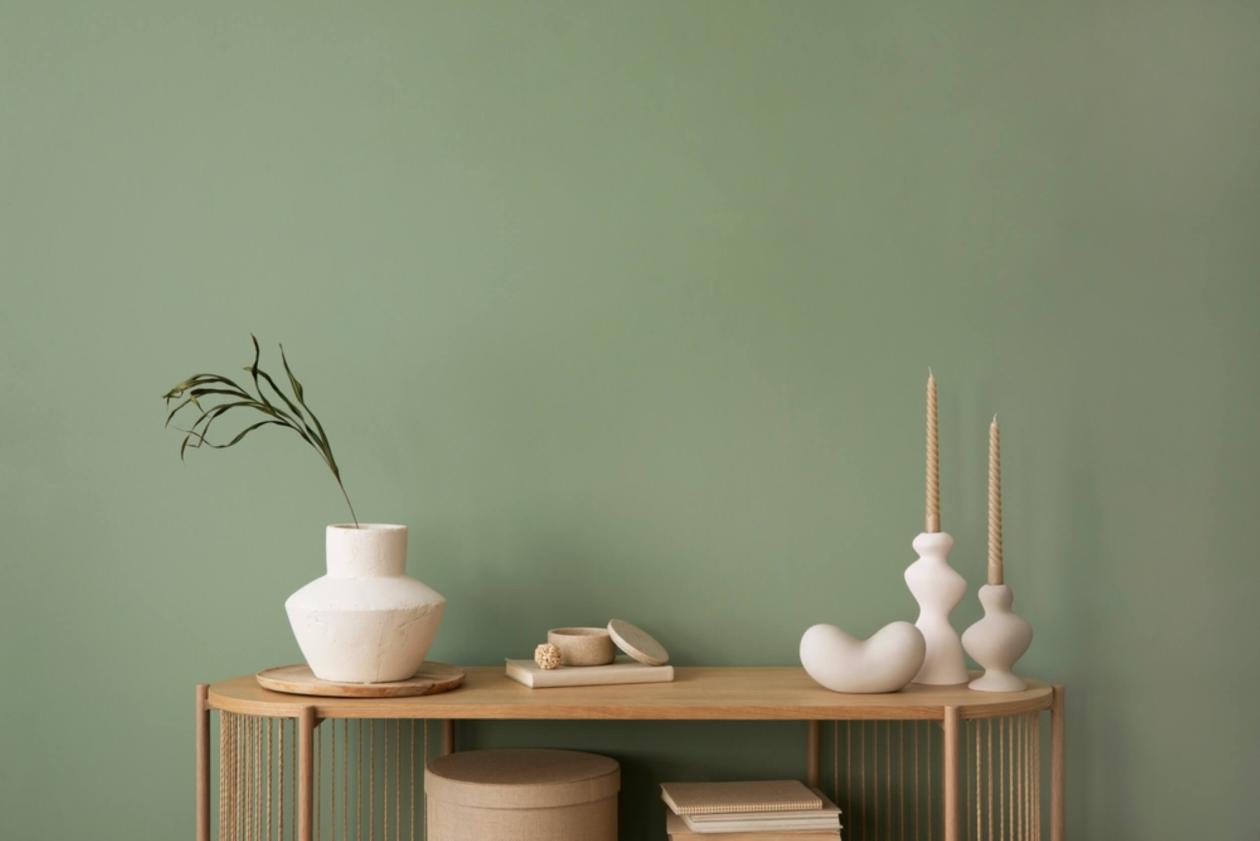
Earthy shades for the living roof
Shades like beige, khaki, smooth terracota or ice grey, in other words the so-called “neutral” or “earthy” shades, are equally safe and flexible options. These shades exude tranquillity, calmness, congeniality and balance, constituting a genuine staple for living room walls. Such examples are KR1972 Nude Sand / F in sand colour, and KR2089 ECO TERRA / F in unripe olive colour, two KRAFT Paints selections from the Inspired Collection fandeck. These, combined with similarly coloured furniture or interior design, result in a streamlined, leasing to the eye space. Combined with warm lighting, living rooms become even more hospitable.
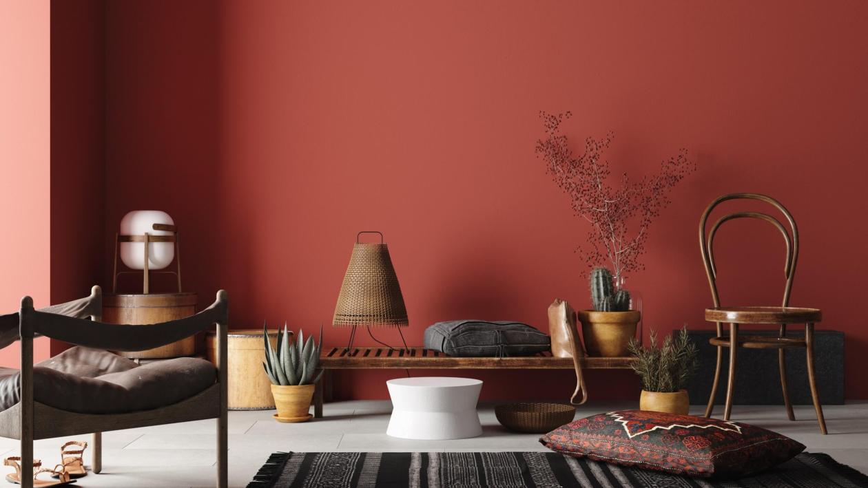
Warm colours for the living room
Warm colours are an admissible exuberance for living room walls; after all, they tend to constitute an excess in their own right. It is imperative that the chosen shade is not contrasting the shade of the furniture. It should rather vary within the same colour range, possibly as a lighter variant. Warm colours are closely befitting to wood and fabrics with textured surfaces. The KR1963 Caramel by KRAFT Paints from the Inspired Collection fandeck, is an excellent example that renders spaces with a affable quality. A sweet and warm brown hue that instantly makes the living room a lovable space.
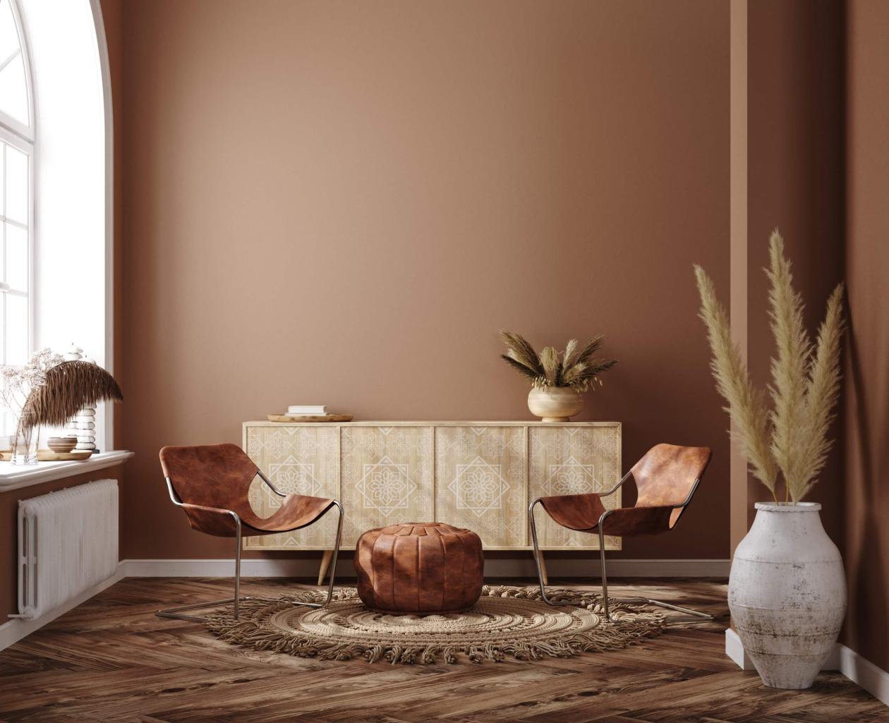
Slightly more push but still part of the same colour palette, the slightly reddish KR1915 Ginger Biscuit by KRAFT Paints can bring spaces to the fore, if selected for one or two opposite-located wall surfaces, thus providing spaces with stance and authority. Both shades change character at night, aided by suitable dimmed or concealed lighting.
Colour combinations for living rooms
Two-tone combinations are trending, however they also constitute a smart way to create an utterly unique living room. In essence, selecting two shades not belonging to the same colour group, the result will be a pleasantly surprising contrast, provided that it is well thought-out. For instance: a pastel and neutral colour pairing will result in a relaxed, sophisticated space; on the other hand, a pastel and warm colour pairing will promote an energetic, lively ambience. Living room colour combinations welcome challenges and allow open interpretations. Fully aligned to the life style of youth, they can provide a family with reasons that make all family members happy.
KRAFT Paints, through the Inspired Collection fandeck, proposes two colour combinations for a living room that you will adore.
Green and brown
One part represents an earthy colour emitting warmth and affinity (e.g. KR2601 Chocolate Dream chocolate brown) whereas the other is a pastel (such as KR1477 Floating Island peanut green), calming and relaxing to the eye. This combination has a touch of class and can become a perfect setting for a living room that is friendly to indoor plants and flowery motifs in furnishings, drapes and interior design.
Yellow and mint
This case comes down to a bright, warm colour that will brighten your space, providing it with warmth and affection. Such a shade is KR1397 New Day by KRAFT Paints, promising a brand new day for your living room. Combined with an especially soft pastel shade such as mint green (e.g. KR1167 Mint Whisper / F, it renders an ultra modern outcome, able to match the decorative elements your space accommodates.
So Let’s KRAFT for the living room of your dreams! Find your ideal shade in our fandecks: – Inspired Collection, Colors of Greece Collection & Reflective Collection and let colours speak for you!
Alternatively, you may find the shade you dream about your sitting room through Chat in Color, our new AI-based colour finder: https://kraftpaints.com/en/kraft-tools/ai-color-gen

